#365 closed enhancement (implemented)
edit4 launch icon not intuitive
| Reported by: | epruesse | Owned by: | westram |
|---|---|---|---|
| Priority: | normal | Milestone: | arb7.0 |
| Component: | Usability | Version: | SVN |
| Keywords: | Cc: |
Description
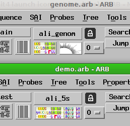
Suggested by Matt. The current icon does not convey properly that this is used to open the sequence/alignment editor. Possibly replace icon by text ("Seq. Editor…"), unless someone can come up with a good icon.
Attachments (2)
Change History (10)
comment:1 Changed 12 years ago by epruesse
- Milestone changed from arb6 to arb6.1
comment:2 Changed 12 years ago by westram
- Owner changed from devel to westram
- Status changed from new to _started
Changed 12 years ago by westram
comment:3 Changed 12 years ago by westram
comment:4 follow-up: ↓ 5 Changed 12 years ago by mcottrell
I like the concept of the new icon on the aligner button.
Just be sure that the icon has sufficient resolution for the ![]() to see the ATGC, etc It was difficult to see that in the attached png.
to see the ATGC, etc It was difficult to see that in the attached png.
Good step forward.
Changed 12 years ago by westram
comment:5 in reply to: ↑ 4 Changed 12 years ago by westram
Replying to mcottrell:
I like the concept of the new icon on the aligner button. Just be sure that the icon has sufficient resolution for the
to see the ATGC, etc It was difficult to see that in the attached png.
Screenshot was in full resolution ![]()
comment:6 follow-up: ↓ 7 Changed 12 years ago by epruesse
I like it ![]()
Let's see what the ![]() at MPI say.
at MPI say.
comment:7 in reply to: ↑ 6 Changed 12 years ago by westram
- Resolution set to implemented
- Status changed from _started to closed

Icon changed by [12570]:
